
Introduction :
This guide is for business owners, digital marketers, and web designers who have built a website for their business but are struggling because it fails to attract customers or generate quality revenue. Even when people visit your site, whether through organic search or advertisements, they often leave without filling out forms, making calls, or purchasing products; this is the primary reason you are losing leads. The best solution is to first understand exactly who your target audience is and build the website specifically for them. Read on to learn more.
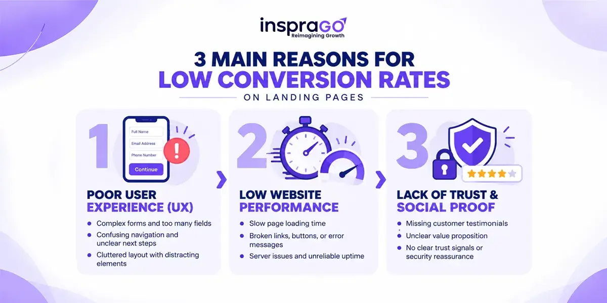
Lets look at the main reasons for low conversion rates on landing pages
Messaging & Value Proposition
- When users land on the page, they don’t immediately know what to do or what the website offers.
- The website’s heading fails to convey what the core business is.
User Experience (UX) & Conversion Optimization
- Users tend to close the page quickly because the content lacks proper alignment and the site suffers from slow loading speeds.
- The presence of multiple, confusing calls to action many of which are irrelevant to the business leaves users bewildered.
- Forcing users to fill out long forms requiring unnecessary information creates frustration
Website Performance & Technical Aspects
- Since most users access the site via mobile, any obstacles in viewing content or visuals combined with slow loading speeds, significantly increase the bounce rate.
- Failure to optimize Core Web Vitals negatively impacts the website’s performance.
You can read here to understand what Core Web Vitals are.
Trust & Social Proof
When visiting a website, the business claims should be backed by evidence rather than just generic content. Simply stuffing the site with information without such proof fails to build user trust.
01
LET'S GROW TOGETHER
Optimized Your Landing Page? Now Get It to Page #1 of Google Before Your Competitors Do!
Message us on WhatsAppHere are some of the best tips to convert visitors to your website into customers.
To convert a visitor arriving at the landing page into a customer within a single flow, the page layout design spanning from header to footer can be structured according to the following Section steps:
Section 1: Set Up the ‘Above-the-Fold’ Layout
The ‘above-the-fold’ area refers to the top section of a website that is visible immediately upon arrival, before any scrolling occurs. Address the user’s reason for visiting your site here. Use headlines and images that convey what your business is and how it benefits the user at a single glance.
Section 2: Include a Clear and Effective H1 Tag
Place a prominent H1 tag (main heading) at the top of the page. This headline should highlight the primary problem the reader faces and clearly indicate that you offer the solution.
Section 3: Display Trust Signals and Certificates
To instill confidence in your business right from the start, display official company certificates, security badges, and accreditations in the upper section of the page.
Section 4: Establish Credibility Early On (Proof/Reviews)
Alleviate customer fears and doubts by earning their trust immediately. To achieve this, showcase success stories, past customer reviews, and case studies prominently at the beginning of the page.
Section 5: Addressing Customer Pain Points
When a visitor arrives at your landing page, the difficulties they are experiencing should be clearly articulated. Create a dedicated section that acknowledges their struggles by asking, “Are you facing these issues?”
Section 6: Conversion-Focused Content
Instead of simply listing general information about your company, focus on content that encourages the reader to become a customer. Clearly explain your service, its features, and the specific benefits the customer gains by purchasing it.
Section 7: Placing Main CTA Buttons
Include primary Call-To-Action (CTA) buttons on the page that align with the reader’s mindset. There should be at least two buttons; one of them should be designed to be instantly compelling (e.g., “Get Free Instant Quote” or “Book a Strategy Call”).
Section 8: Comparison with Competitors and Your USP
People often compare options before making a purchase. Therefore, include a comparison chart demonstrating why your service is superior to that of other companies. This is the place to highlight your business’s Unique Selling Point (USP).
Section 9: Step-by-Step Process
Clearly and simply explain the process of delivering your service to the customer, breaking it down into sequential steps (e.g., Step 1, Step 2).
Section 10: FAQ Section (Addressing Customer Queries)
When considering a purchase, customers often have various questions or doubts. Address these concerns by providing questions and answers in an FAQ format (such as an accordion style) in this section.
Section 11: Final Buttons (Closing CTA)
Place two Call-to-Action (CTA) buttons at the very bottom of the page to encourage the reader to place an order. One of these should prompt immediate contact without delay.
The Insprago Guarantee: Designed for Maximum Speed, Trust, and 3x More Leads
|
Features / Benefits |
insprago | Other Developers |
|
Page Loading Speed |
Under 3 Seconds |
5 – 8 Seconds |
|
Free CRO Audit Support |
Included ✅ |
Not Provided |
| Mobile Responsiveness | 100% Fully Optimized |
Basic Layout |
02
LET'S GROW TOGETHER